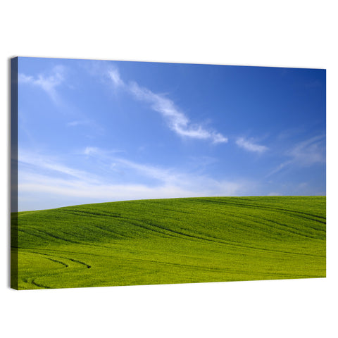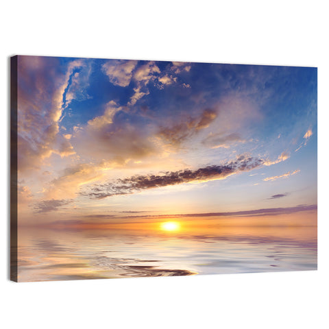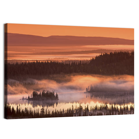






The best calming colors for bedroom walls and wall art are soft blue, muted green, warm white and gentle neutrals. The Sleep Foundation notes that people link blue with calm and green with relaxation, and that bright reds, oranges and yellows are more stimulating. Choose low-saturation shades, then hang art in the same family.
- The Sleep Foundation names blue, green and white as the colors most tied to rest, and red as possibly the worst bedroom color, so choose art where calm colors cover most of the picture.
- It also states that little research directly links wall color to sleep, so treat color as one comfort factor, not a cure.
- A Travelodge survey of about 2,000 British homes found blue bedrooms averaged 7 hours 52 minutes of sleep, a hotel-chain survey and not clinical evidence.
- Hang art 8 to 12 inches above a headboard, at about two thirds to three quarters of its width.
- Keep the saturation low: the same hue reads calm in a muted shade and busy in a bright one, in a picture as on a wall.
What Is the Calmest Color for a Bedroom?
Soft blue is the most widely cited calm color, with muted green close behind. The Sleep Foundation says people tend to associate blue with calmness and relaxation, and that green has a relaxing effect linked to nature. White rooms may help because they stimulate the brain less than colorful rooms. Art that is mostly one of these colors lets you add the calm without repainting.
Shade matters more than hue. A dusty blue-gray feels restful, while a saturated royal blue feels bold, and the same goes for a picture: a pale sea reads calm where a deep cobalt abstract reads loud. Our blue wall art includes pale seas and misty lakes that hold to the calm end of the range.

Which Calming Bedroom Colors Work Best?
Pick by how you want the room to feel and how much light it gets. The table pairs each calming color with its mood and the art that suits it.
| Color | Mood | Best in | Art that suits it |
|---|---|---|---|
| Soft blue or blue-gray | Calm, cool | Sunny rooms | Seascapes, pale lakes |
| Muted sage green | Restful, natural | Any light | Forests, ferns, meadows |
| Warm white or cream | Quiet, open | Small or north-facing rooms | Minimal landscapes |
| Greige or soft taupe | Cozy, grounded | Any light | Neutral abstracts |
| Blush or pale clay | Gentle, warm | Rooms with warm wood | Soft clouds, sunrise |
For the neutral end, our neutral wall art works with cream, greige and taupe walls.
Which Colors in Bedroom Art Help You Wind Down?
Blue is the best-supported answer, though the evidence is modest. The Sleep Foundation reports that people with blue bedrooms had the longest average sleep in a survey, and also states that little research directly explores color and sleep. Travelodge's survey of about 2,000 British homes found blue rooms averaged 7 hours 52 minutes. A blue-gray seascape is a safe first pick for the wall above the bed.
That figure comes from a hotel chain's survey, so use it as a hint. Light, noise and temperature matter as much as the color of a wall or a picture. The Sleep Foundation adds that the best sleep environment is dark, so choose art that looks calm by day and sits back at night: soft blues and grays with low contrast.
Watch out: Do not treat a color, on a wall or in a picture, as medical advice. If sleep or anxiety is a problem, a doctor can help in ways art cannot.
Which Colors Should You Avoid in Bedroom Art?
Avoid pictures where saturated red, orange or bright yellow covers most of the image. The Sleep Foundation describes those colors as stimulating, calls red possibly the worst bedroom color, and links it to higher pulse rate and aggression in research on color. It also says black and dark brown can bring negative associations.
Small amounts are fine. A red poppy in a mostly green meadow or a gold sun low over a blue sea adds warmth without taking over the piece. Dark pictures are not banned either: a deep navy seascape can feel cocooning when the room is used mainly at night, but it needs soft lighting and light bedding to avoid heaviness.

What Are the Best Calming Colors in Bedroom Art for Anxiety?
The same soft blues, greens and neutrals are the usual choices, because they are low in contrast and low in saturation. No color treats anxiety, on a wall or in a picture. What a calm palette does is remove visual noise from the one room where you want to wind down.
Keep the palette to two main colors and one accent. A pale blue wall, white bedding and one green-toned piece of art reads as a quiet whole. Our post on calming art and wellbeing goes further into how images affect mood.

How Do You Choose Calming Wall Art for a Bedroom?
Match the art to the wall color, then size it to the bed. Soft subjects such as clouds, water, mist and meadows keep the mood quiet. Browse bedroom wall art, cloud wall art and lake wall art, and pick scenes with a low horizon and plenty of open sky.
- Note your wall color and its undertone, warm or cool, before you look at any art.
- Choose art where that color covers most of the picture.
- Size the piece to about two thirds to three quarters of the headboard width.
- Hang the bottom edge 8 to 12 inches above the headboard.
- Look at the piece in the evening, under your bedside lamp, before you add anything else.
Pick the finish for the room as well. A Canvas Print has no frame line and suits a soft bedroom, while a Framed Canvas or Framed Print suits a room with darker wood.
Take a queen bed with a 64 inch headboard whose top is 52 inches from the floor. Two thirds to three quarters of 64 is 43 to 48 inches, so a 48x32 inch landscape canvas fits. Hang its bottom edge 10 inches above the headboard, at 62 inches. The center then sits at 78 inches, which is higher than the usual 57 to 60 inch guide because the bed rule wins.

How Do You Test Calming Art Colors Against Your Bedroom?
Hold the product image next to your wall color at the time of day you use the room. Morning light, afternoon light and lamp light each shift an undertone, so a blue-gray picture that looks restful at noon can read cold at night. Check the art beside your bedding as well.
Pro tip: View the image on your screen beside a paint chip or a fabric swatch in the evening. If the colors fight under lamp light, choose another picture in the same family, not a different lamp.
Our guide to interior paint colors covers undertones in detail, which helps when you match a piece to a wall, and the coastal bedroom post shows blue and sand art in full.

Every piece is printed to order and ships free across the US. Start with the color of your walls.
Quick answers
Common Questions
What is the most psychologically calming color for bedroom art?
Blue is the color most often linked to calm. The Sleep Foundation says people tend to associate blue with calmness and relaxation, and green with a relaxing effect. The evidence is mostly about association and mood, not treatment, so choose a soft shade in a picture that you personally find restful.
What colors should you avoid in bedroom art?
Avoid pictures dominated by saturated red, orange or bright yellow. The Sleep Foundation calls red possibly the worst bedroom color because it is stimulating, and says orange and yellow may not promote sleep as well as cooler colors. A small accent is fine, and black or very dark brown works only with soft lighting.
What color calms you down to sleep?
Soft blue is the best-supported choice, followed by muted green and white. A Travelodge survey of about 2,000 British homes found blue bedrooms averaged 7 hours 52 minutes of sleep. That is a survey, not clinical proof, and a dark, quiet, cool room matters as much as color, so hang art that stays soft at night.
What are the top 3 bedroom colors for wall art?
Blue, green and warm neutral are the three most recommended. Blue and blue-gray suit sunny rooms, muted sage green suits any light, and cream or greige suits small rooms. Choose low-saturation versions, and echo the color in one piece of art above the headboard.
What size art goes above a bed?
Aim for about two thirds to three quarters of the headboard width and hang the bottom edge 8 to 12 inches above it. For a 64 inch headboard that is 43 to 48 inches, so a 48x32 inch landscape fits. Choose a soft subject such as clouds, water or a meadow so the wall stays quiet.